Client Success Stories
Under Studio Mei, I solved design needs for startups and corporations.
Acorn Academy Rebranding
I rebranded an English speech coaching startup, which improved its online impressions and conversion rates.
Acorn Academy • 2024 (3 weeks)
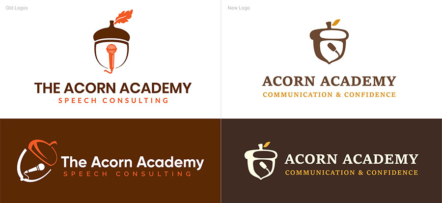
Old logos needed an upgrade to reflect professionalism.
Acorn Academy teaches storytelling and public speaking through free tips, workshops, mentorship, and courses. The goal was a brand built on professionalism, passion and hope. The brand name and tagline were updated to match.
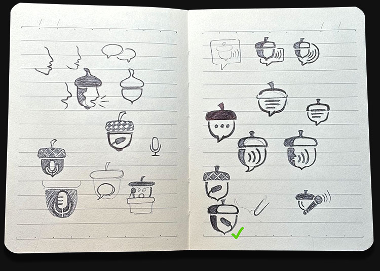
Ideating and discussing with the client.
I started with rough sketches and mood boards, then refined several concepts with the client. The hard part was merging an acorn with a speech element. Students mistook the first microphone for karaoke, so we switched to a podium mic, which reads as presenting and public speaking.
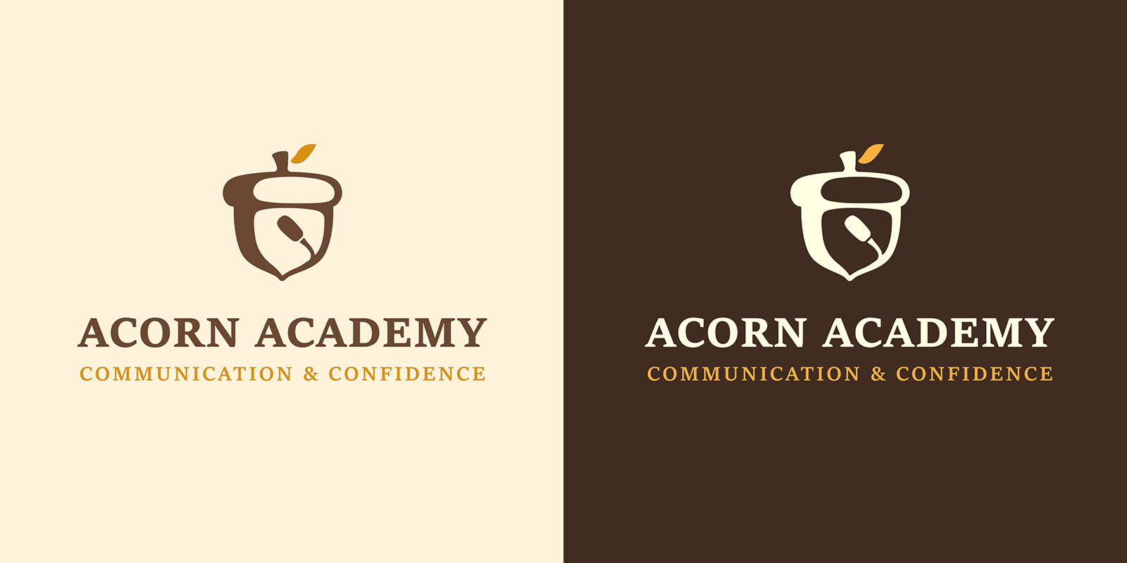
Conveying communication & confidence.
The upright icon, yellow acorn leaf and serif logotype stand for professionalism, passion and hope.
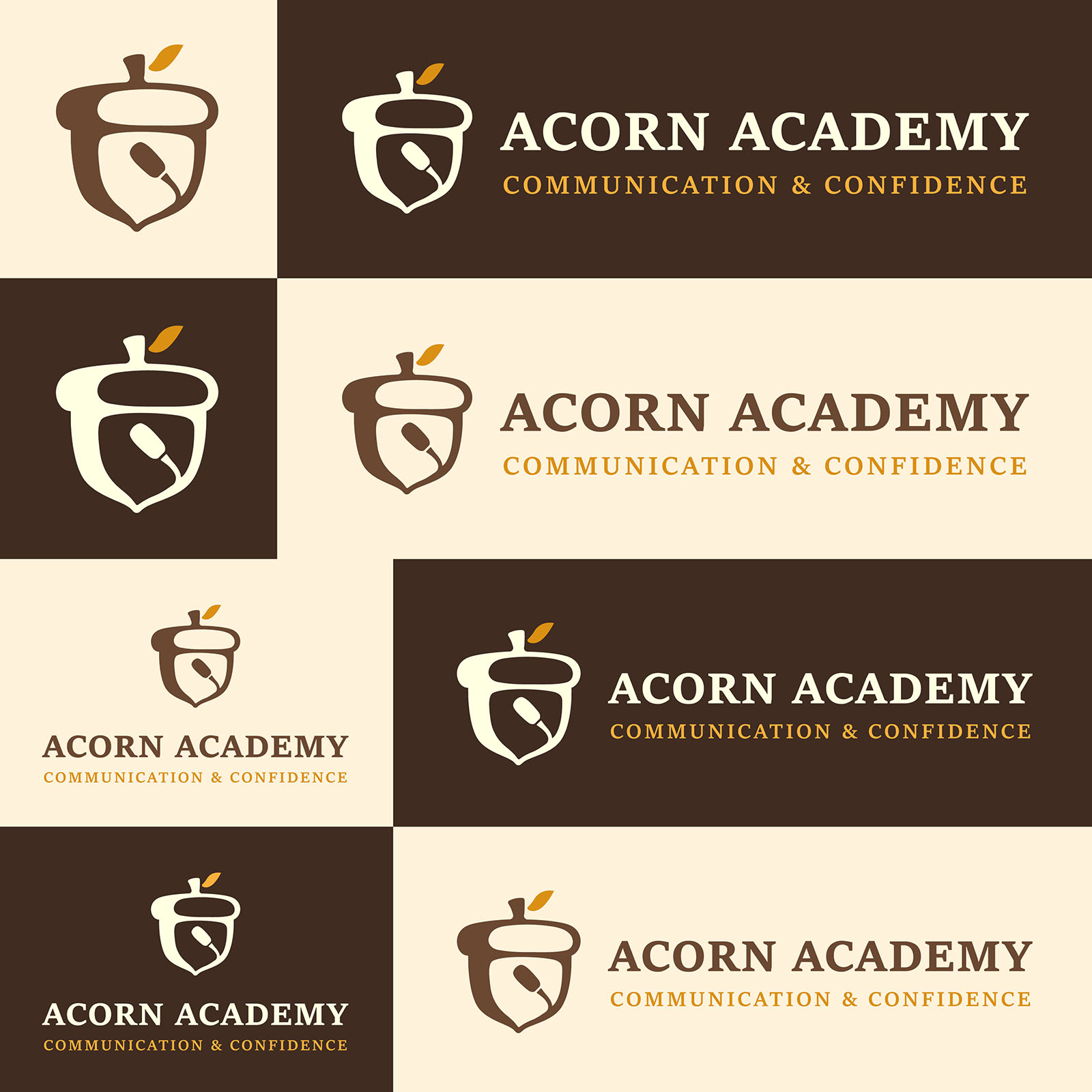
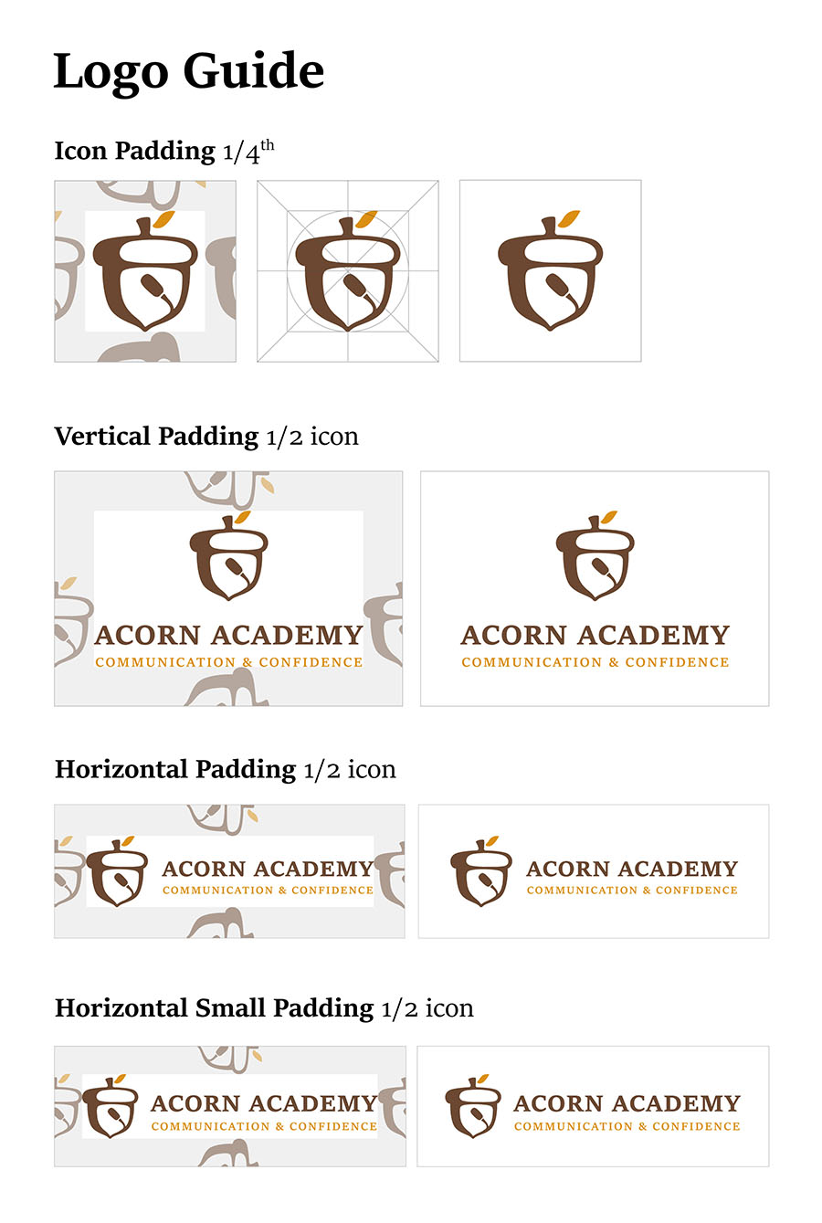
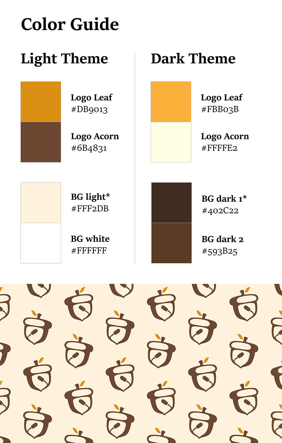
Usage guide for best practices.
I gave the client logo and color usage guides, since the brand lives mostly in social media posts. The palette uses natural tones with moderate saturation so it's easy on the eye.
Baixian Food Packaging
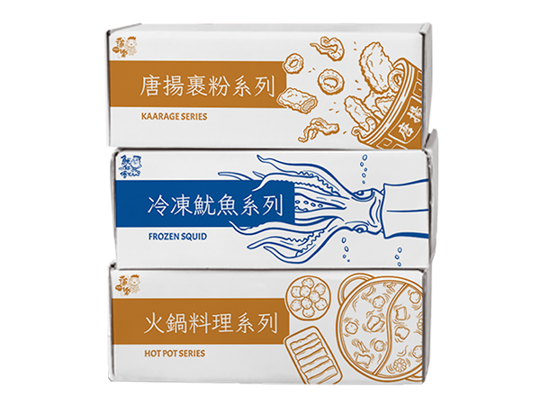
I created 8 scalable packaging designs for a food material supplier with the end users being retailers and distributors.
Baixian Food • 2024 (1.5 months)
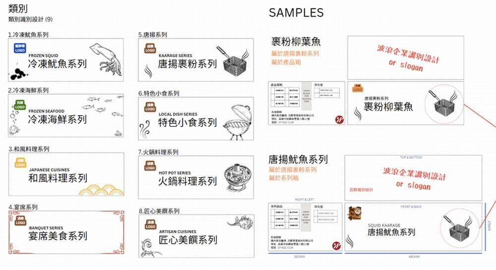
Specifications from the client.
The client briefed me on the theme, art style, color usage and dimensions. They had a clear vision, and I explored a few nearby concepts too.
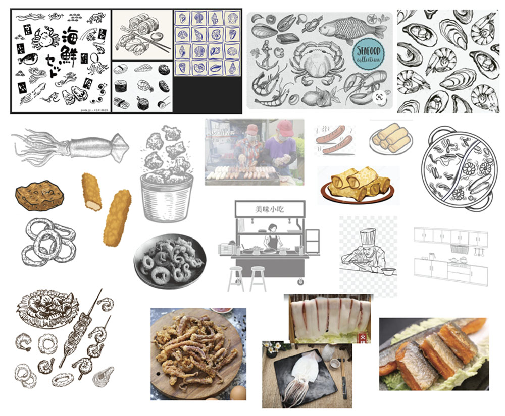
Gathering inspiration and references.
I gathered product photography, online drawings and real-life photos for visual accuracy. Drawing from scratch isn't my strength, so I traced and adapted references to reach a line style halfway between cartoon and serious.
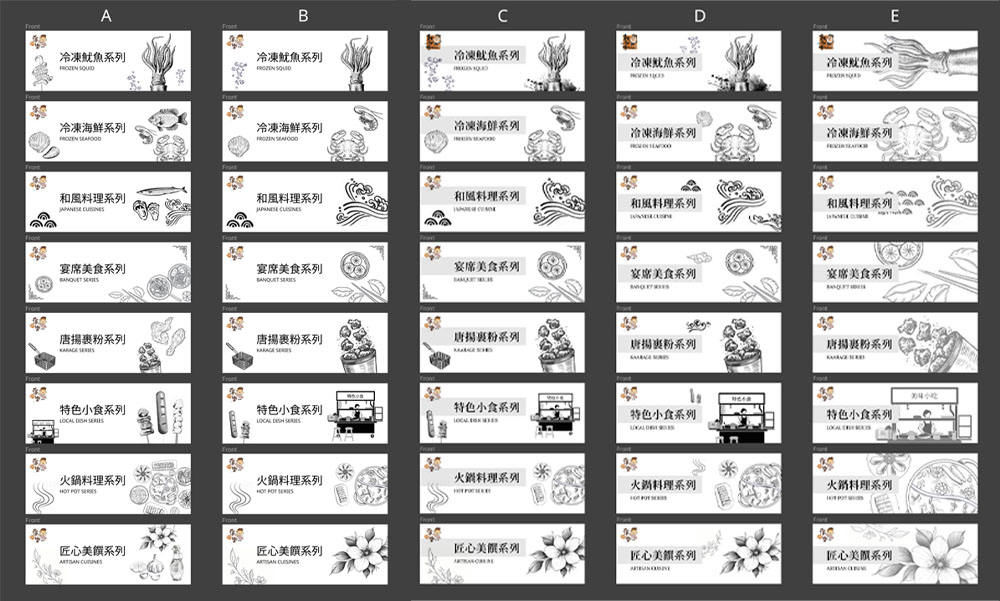
Refining through revisions.
Over 3 client meetings, I drafted 5 iterations in Figma for early discussion, then moved to high-fidelity designs in Illustrator. The hardest part was choosing food or cultural elements for each series, since each series had a fixed set of foods.
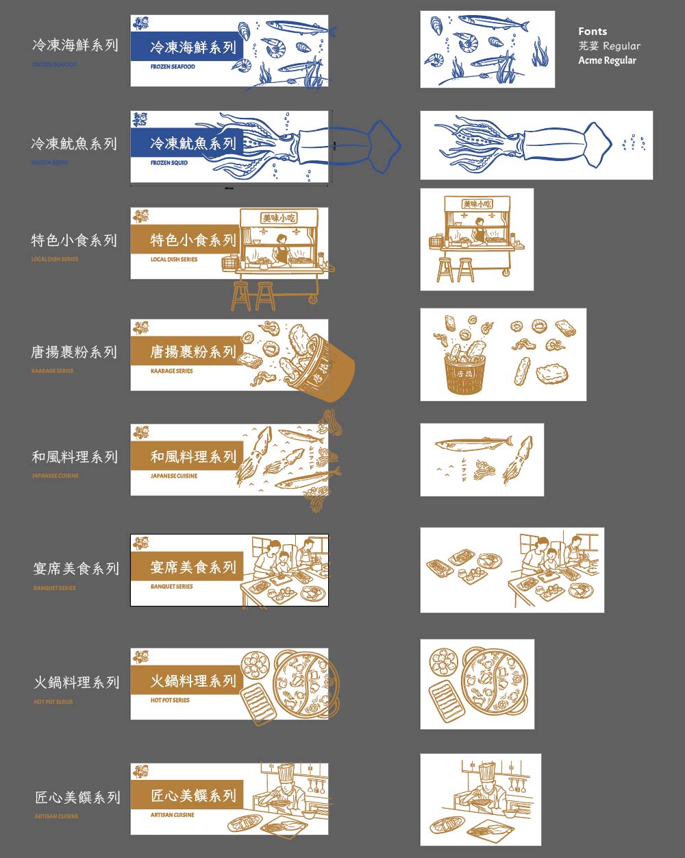
Deliverables include cover images and reusable assets.
Each series went through 3 to 5 revisions. I delivered box designs for 8 frozen food series, with every element prepared for future work such as plastic bags and other accessories.
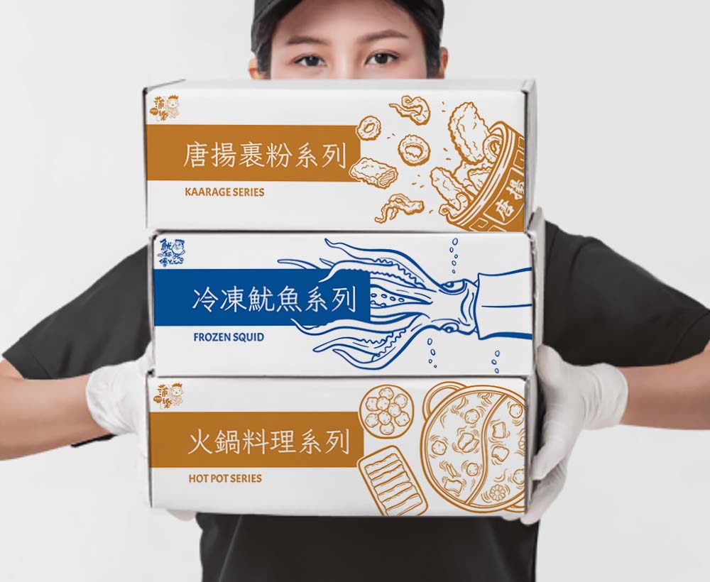
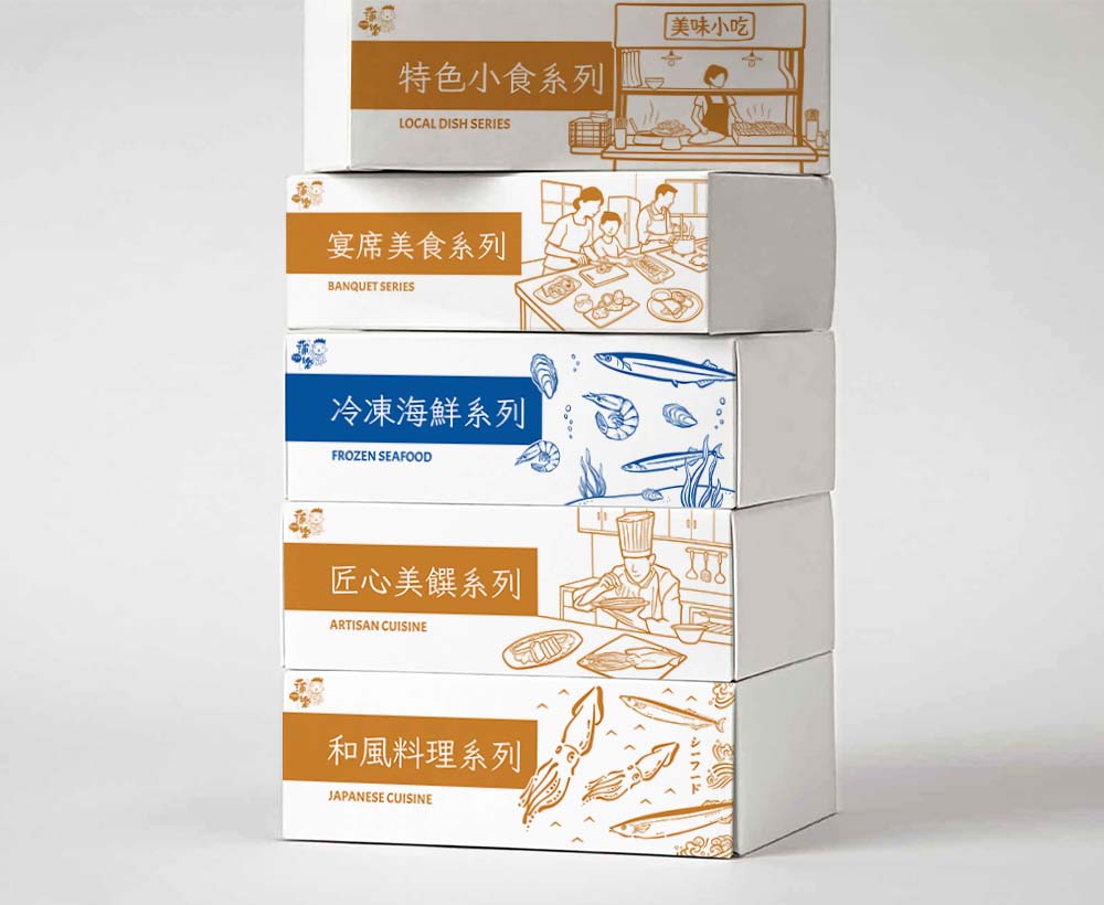
Final renderings for client sign-off.
I made Photoshop renderings from mockup templates to show the finished packaging. We used only two colors to save printing costs, blue for seafood and light brown for other pre-cooked dishes.
QTS Corp. Brand Visuals
I partnered with a sales manager to create marketing and exhibition materials for QTS Corporation's expansion, introducing YouV Art and Overhang Lab to the US market.
QTS Corporation • 2023 (6 months)
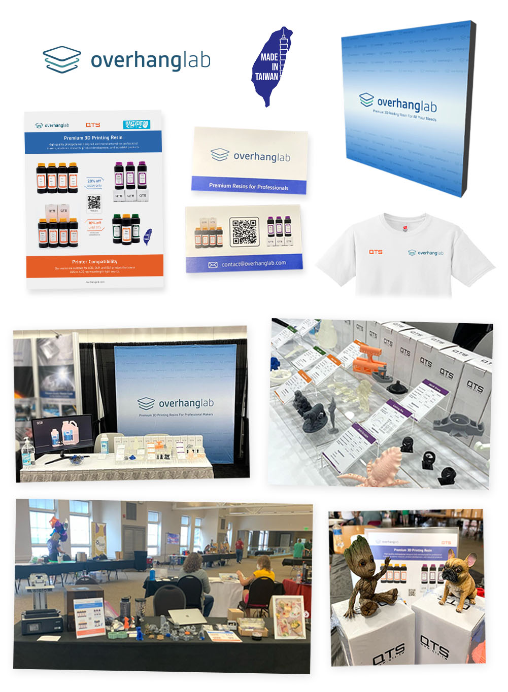
Helping a new 3D printing brand get noticed.
Overhang Lab LLC, a subsidiary of QTS Corporation, specializes in premium 3D printer resins for professional makers. Our primary objective was to expand into the US market by finding retailers and distributors. The sales manager and I planned three exhibitions, started Instagram and Facebook channels and ran an email marketing campaign. Our work brought in several leads and started more than three business relationships.
As the part-time graphic designer, my responsibility was to develop Overhang Lab's visual identity and marketing material. This included exhibition material such as pop-up displays, flyers, info cards, and marketing collateral such as social media posts, banners, and EDM.
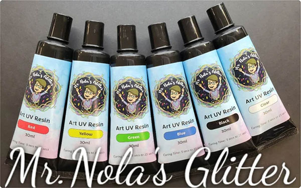
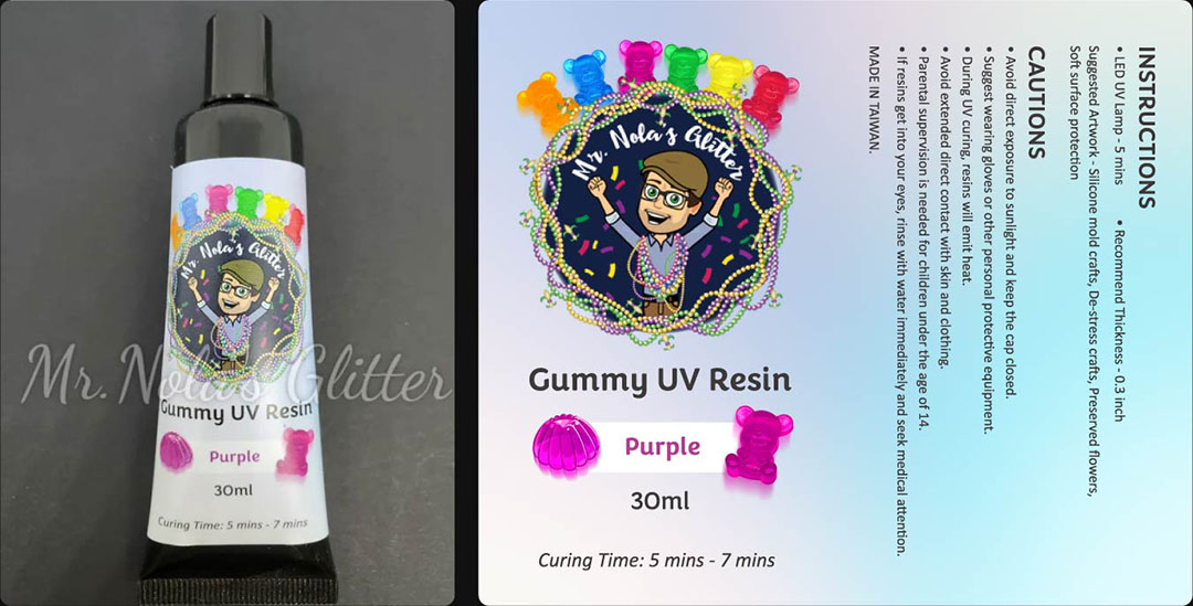
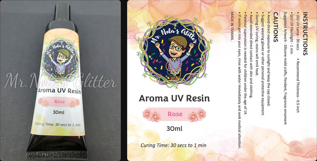
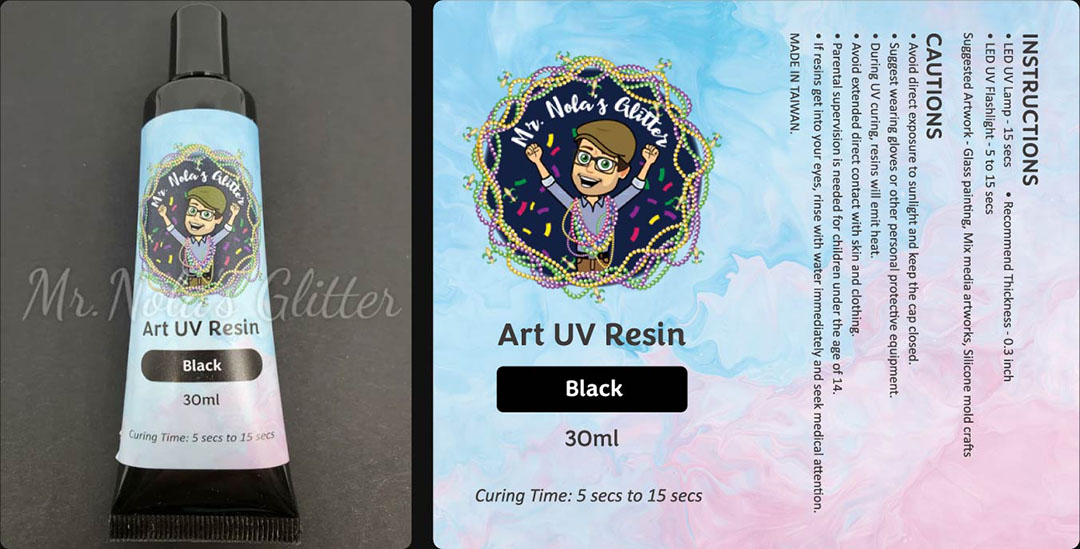
A partnership that brought the gels to US retail.
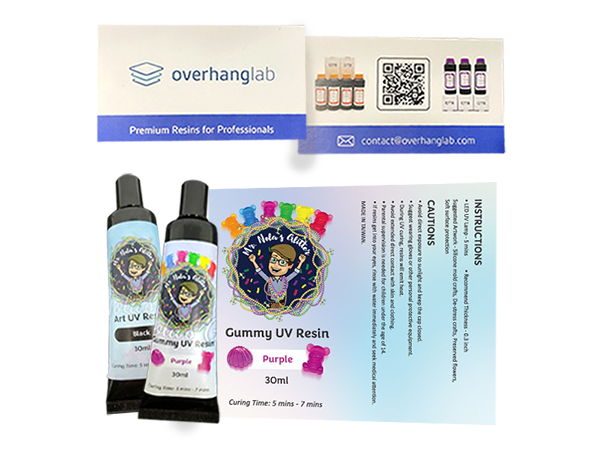
YouV Art partnered with Mr. Nola's Glitter, a supplier of glitter and crafting resources, to distribute UV art gel resins both in retail stores and online across the US. The gels sold well for their scents, gummy texture and fast drying.
I led the packaging design for the four product lines, Aroma, Art, Gummy, and Jewelry resin gels. The hard part was showing what made each product different. After 5 iterations, the final design told the four apart while keeping one look.