Launching the world's first color printing laser cutter
Ador, the world's first color printing laser cutter, was hard to explain. I designed its launch landing page, which made its value clear, broke two traffic records and helped lift net revenue by 12%.
FLUX Inc. • 2023
UI/UX
Web & Visual design
B2B2C
Overview
Designed the launch landing page for Ador, the world's first color printing laser cutter, which broke two traffic records and contributed to a 12% rise in net revenue.
- +12%annual net revenue
- 2traffic records
- <5spage load
- #1launch priority
Ador was the world's first color printing laser cutter, but its modular system and technical features made it hard to explain. Users needed to understand how three different modules worked together before they could see the value.
I designed a landing page that broke down the complexity into clear, scannable sections. Working with Marketing, I shaped the content hierarchy, created supporting visuals, and built the responsive page in WordPress.
- Role
- Product DesignerResponsive web · Visual design · Branding · Video · Rendering · Content
- Team
- 2 Designers · 2 MarketingStakeholders: CEO, CGO, EU distributors
- Timeline
- Shipped December 20231 month
Understand
Studied Ador's modular system and what hobbyists, small businesses and distributors needed to know before buying.
Audit
Reviewed past FLUX landing pages and competitor sites for gaps in structure, hierarchy and responsive layout.
Build
Shaped section order and copy with Marketing, designed in Figma, then built the responsive page in WordPress.
Optimize
Checked every screen size, compressed assets for faster loading, and refined visuals from stakeholder feedback.
Highlights
A clear landing page helped users see Ador's value.
The page simplified a complex product into scannable sections, driving record traffic and strong conversion.
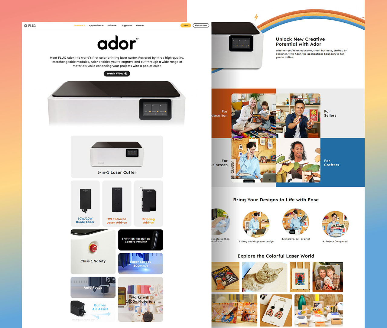
The landing page became the main entry point for ad traffic. Clear content structure helped users understand Ador's three-module system, contributing to a 12% increase in net revenue.
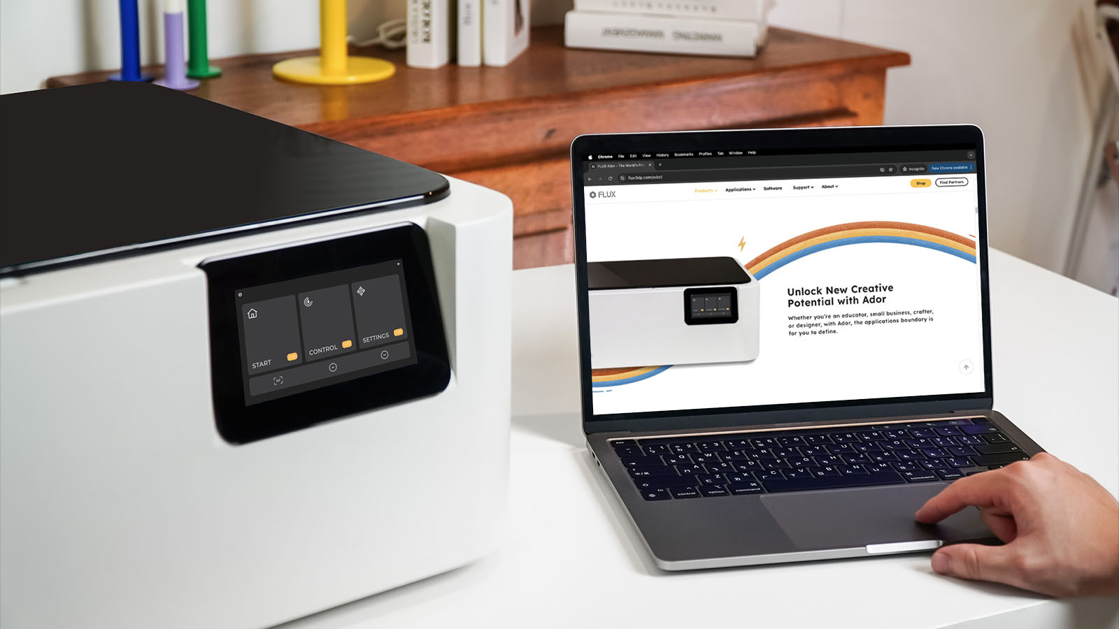
Existing FLUX users upgraded to Ador after seeing the new color printing capability. The page broke two website traffic records within a month of launch.

Context
A new kind of machine that's hard to explain.
Understanding Ador's complexity helped me shape how the landing page would communicate its value.
Three modules, one machine.
Ador combines a diode laser, infrared laser, and color inkjet printer into a single device. It's built for small businesses, hobbyists, and educators who want to print and cut without switching machines.
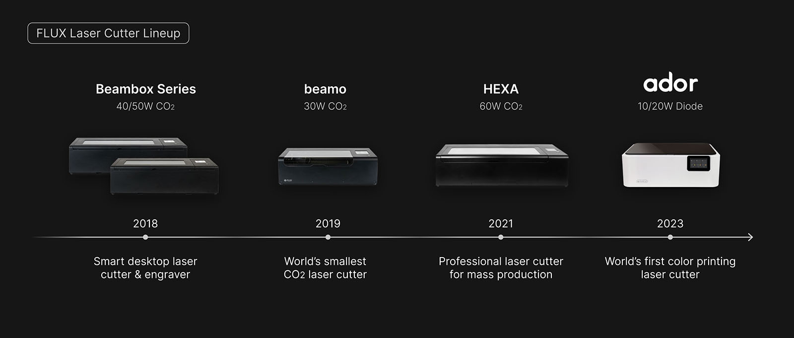
Two years of development, never done before.
Integrating inkjet printing into a laser cutter took over two years. Before Ador, users needed separate printers and cutters to create colored designs. Ador removes that extra step.
Problem
Users needed to see value before they understood specs.
Adding color took extra steps. The specs confused new buyers. The global launch was four weeks away. The landing page had to make educators and makers feel confident, not confused.
From support tickets, our annual survey, user groups and partner feedback.
Rachel is a STEAM teacher.
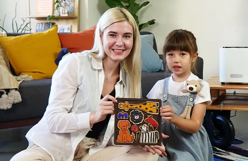
- Teaches
- A maker lab for grades 4 to 7
- Makes
- Name tags, puzzles and cardboard automata
- Needs
- Color projects that fit in one class period
Problem 1
Color meant extra steps
Printing on paper, then gluing onto wood before cutting: hours of prep for a class of 25.
"I wanted my students to make colorful keychains, but the extra steps made it impossible in a 45-minute class."
What it led to: Lead with color printing
Problem 2
Too technical for new buyers
Two lasers and a printer in one machine sounded complicated to educators new to laser cutting.
"I don't need to know the wattage. I need to know if my students can make something colorful in one class period."
What it led to: Show outcomes, not specs
Constraint
One month to launch globally
EU, US and international release at once: page, visuals, distributor assets and testing in four weeks.
What it led to: Shipped on time, tested on every screen size
Three challenges, one landing page.
The goal was to turn a complex product into a clear story that helped users imagine what they could create.
Iterate
Turning complexity into clarity.
I worked with Marketing to shape content hierarchy, reduce text, and create a layout that helped users scan instead of read.
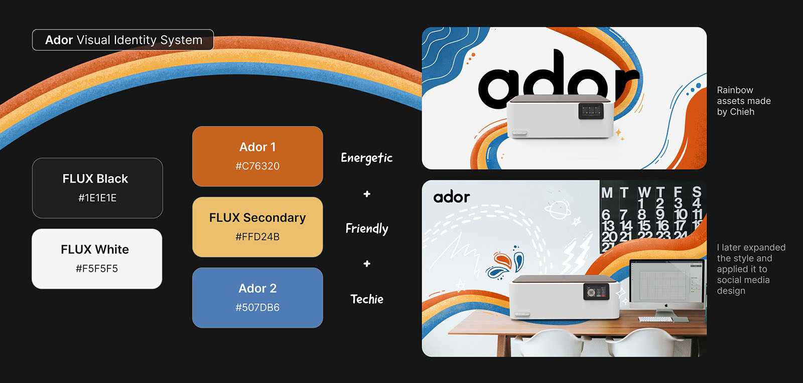
Starting with the brand system.
Ador's visual identity used a red, yellow, and blue rainbow to highlight its color printing capability. I applied this system to the landing page while keeping the layout clean and scannable.
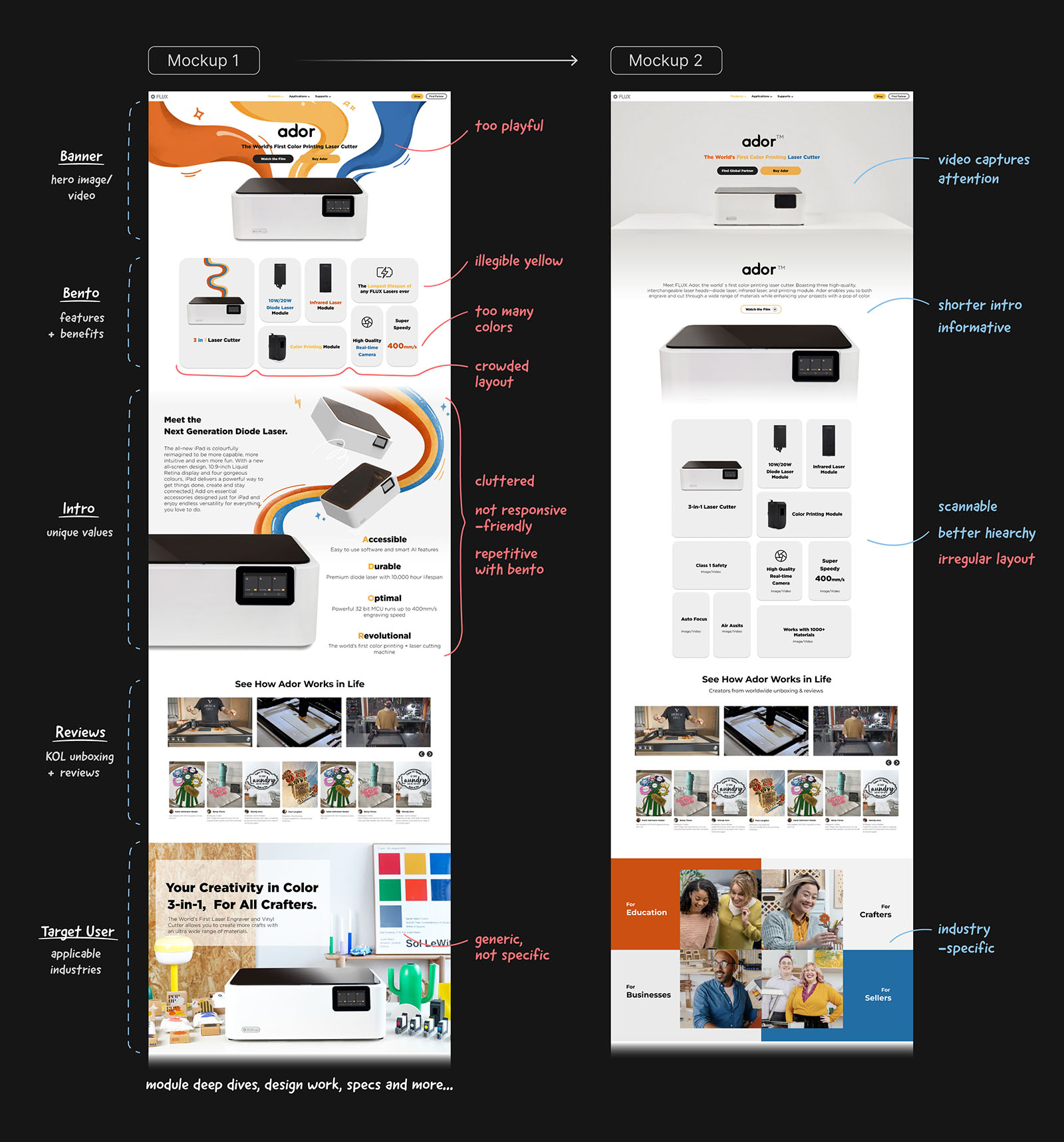
Four rounds of refinement.
Marketing provided an initial mockup with loose content and section order. Over four iterations, I cut text length, simplified the layout, and added white space. Each round made the page easier to scan.
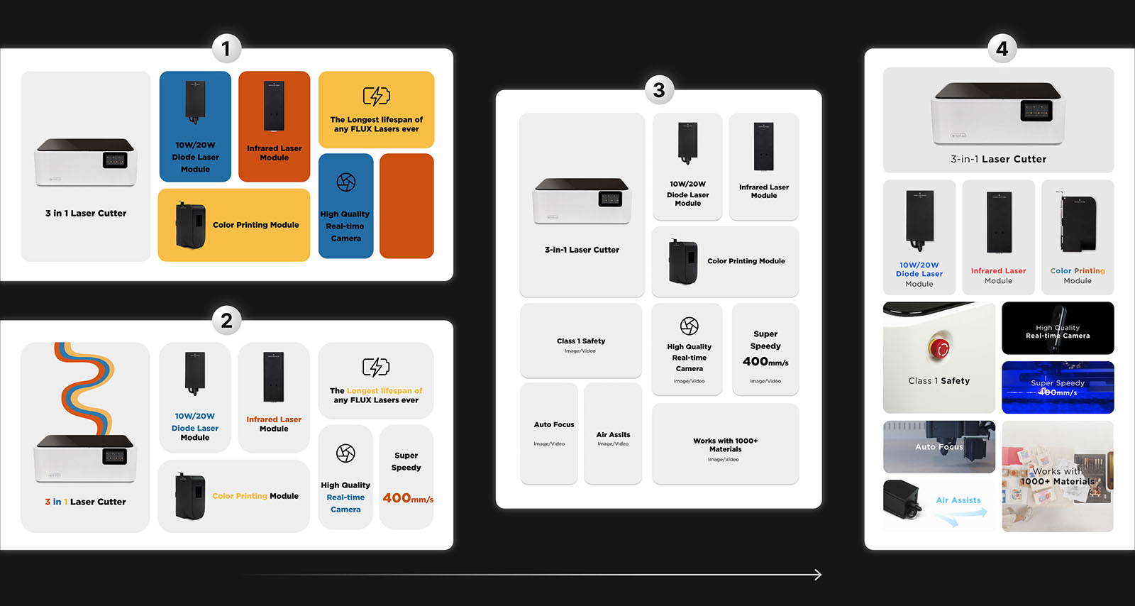
Leading with what users care about.
The hero section used a bento grid to show Ador's three modules at a glance. Instead of listing specs, I prioritized the features laser cutter users search for: work area, material compatibility, and ease of use.
Implement
Building a page that performed as good as it looked.
I designed and built the page in WordPress, optimizing for responsive layout, fast load times, and consistent visuals across devices.
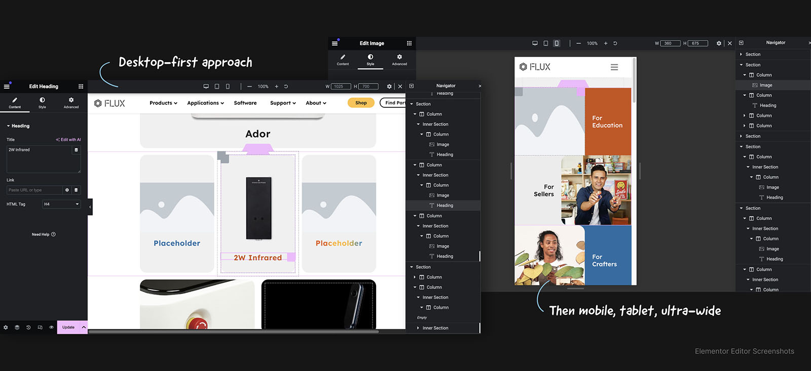
Starting fresh to set a new standard.
Previous FLUX landing pages lacked consistent styling. I built Ador's page from scratch to establish a cleaner foundation for layout, typography, and visual hierarchy. I collaborated with our frontend engineer to solve CSS and responsiveness issues along the way.

Optimizing and testing before launch.
Early versions took over a minute to load. I compressed images, converted GIFs to MP4, and reduced plugin bloat to bring load time under 5 seconds. Before launch, I tested responsiveness across desktop, tablet, and mobile, verified all links, and confirmed interactivity worked across browsers.
Launch
A landing page built for clarity and conversion.
The page launched in December 2023 and became the main entry point for Ador's global campaign. It broke two website traffic records within the first month.
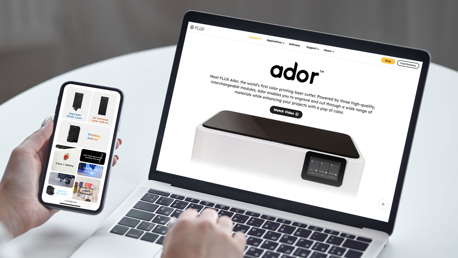
The first stop for curious buyers.
Users who clicked an ad or searched "color printing laser cutter" landed here first. The page needed to answer their questions quickly: What does Ador do? What can I make with it? Is it right for me?

Leading with video and product shots.
The hero section used a bento grid with looping video and real product photos. Video grabs attention fast, and product shots add credibility. I simplified the layout by reducing the number of boxes, making it easier to scan.
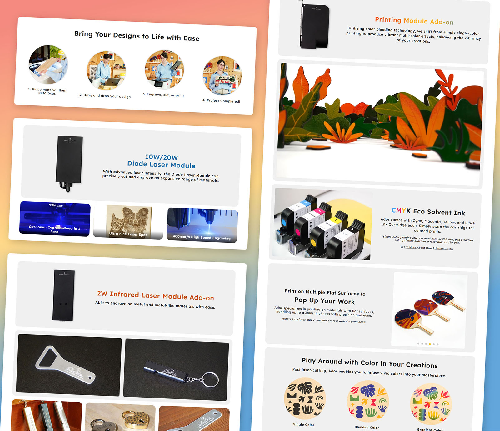
Showing what each module can do.
Each section paired a module description with example work. Instead of listing specs, I showed what users could create with the diode laser, infrared laser, and color printer. Educators like Rachel could picture their students making colorful keychains in one class.
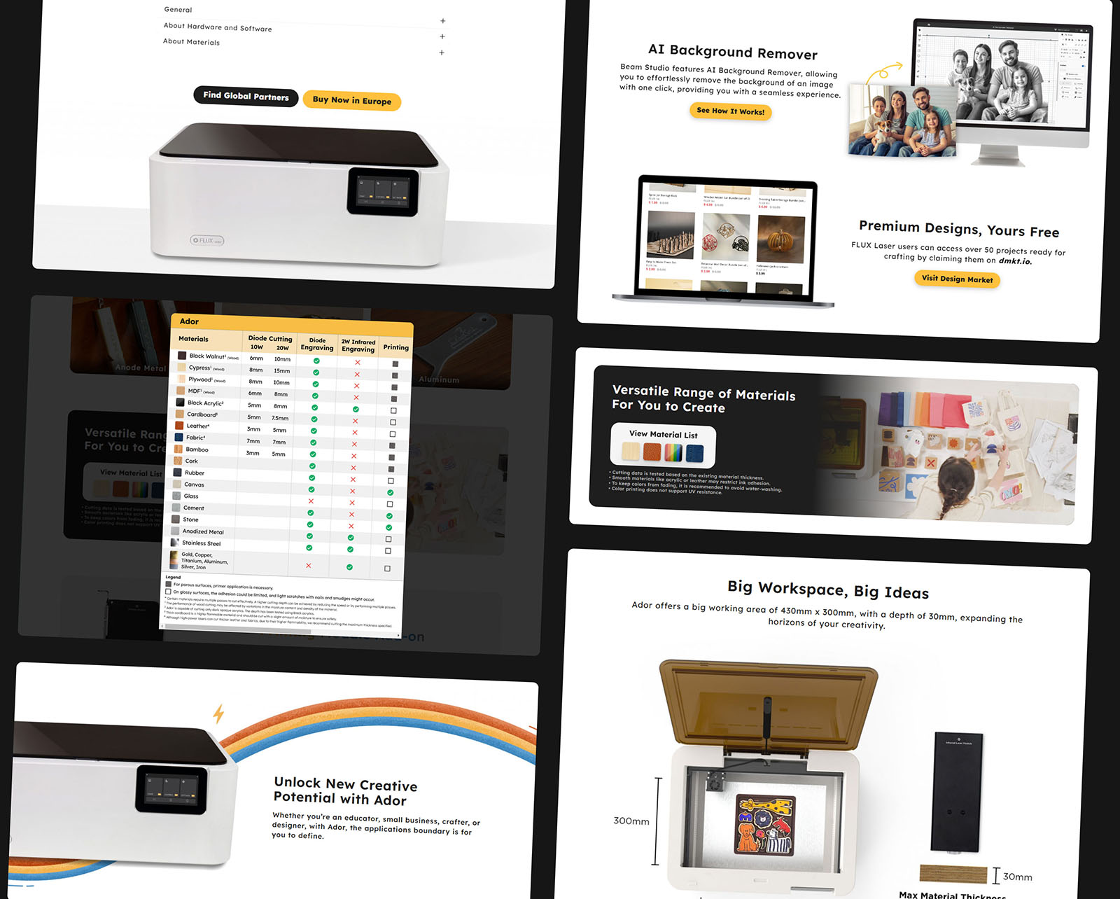
Specs for those who want them, CTAs for those ready to buy.
Technical details and material compatibility were placed in the second half of the page for users who wanted to dig deeper. The FAQ and CTAs at the end guided users toward a decision, whether that was purchasing or requesting a demo.

Reflection
Strong launch, but engagement needs work
The page drove record traffic and conversions, but users averaged only 35 seconds per session. There's room to improve how deeply they engage with the content.
Impact
Primary marketing funnel
The landing page became the primary entry point for ad campaigns across EU, US, and international markets.
Broke web traffic records
Page views broke two company records within one month, showing strong user interest and engagement.
12% increase in net revenue
Clear content structure helped first-time visitors understand Ador's value, contributing to a 12% increase in net revenue.
Next Steps

Average session is 35 seconds, which suggests users aren't scrolling deep. Test content order and page length.
Large assets and plugin bloat slow the page. Work with engineering to reduce load times.
Experiment with button position and wording to improve conversion from page visits to purchases.