One design system for 6 laser cutters in 20 languages
FLUX's laser cutter firmware was outdated, inconsistent and broke in other languages. I redesigned it around one design system that works across 6 laser cutters and 20 languages.
FLUX Inc. • 2024
UI/UX
Design system
Firmware
B2B2C
Overview
Redesigned BeamOS, the touchscreen firmware on FLUX laser cutters, around one design system now used on 6 machines in 20 languages by 40k+ makers.
- −20%task completion time
- −30%support tickets
- 6product lines
- 40k+users
FLUX laser cutters have a built-in touchscreen for setup, calibration, and monitoring. But the interface hadn't been updated in 3 years. Users dealt with inconsistent layouts, unclear labels, and missing feedback states.
I redesigned the firmware UI and built a scalable design system covering navigation, typography, modals, icons, and error states. The new interface improves clarity, accessibility, and consistency across 6 laser cutter models.
- Role
- Sole Product DesignerUI/UX · Prototyping · Iconography · UX writing · Handoff
- Team
- 2 Product Managers · 2 Full-stack Engineers
- Timeline
- Shipped November 20241.5 months design · 3 months development & testing
Audit
Reviewed every firmware screen across 6 laser cutter models for inconsistencies in layout, type and interaction.
Define
Built a unified design system covering colours, typography, icons, components and their states.
Redesign
Prioritised high-impact screens with PMs and engineers, then designed and prototyped their new layouts.
Test
Ran common tasks on physical machines and iterated on the gaps before launch.
Highlights
A modern interface for 40k users across 6+ laser cutters.

Unified Design System - Consistent colors, typography, and components across all screens.

20-Language Support - Responsive layouts that handle Arabic, German, and everything in between.

Touch-Optimized Controls - Larger tap targets and clearer feedback for gloved hands and busy workshops.
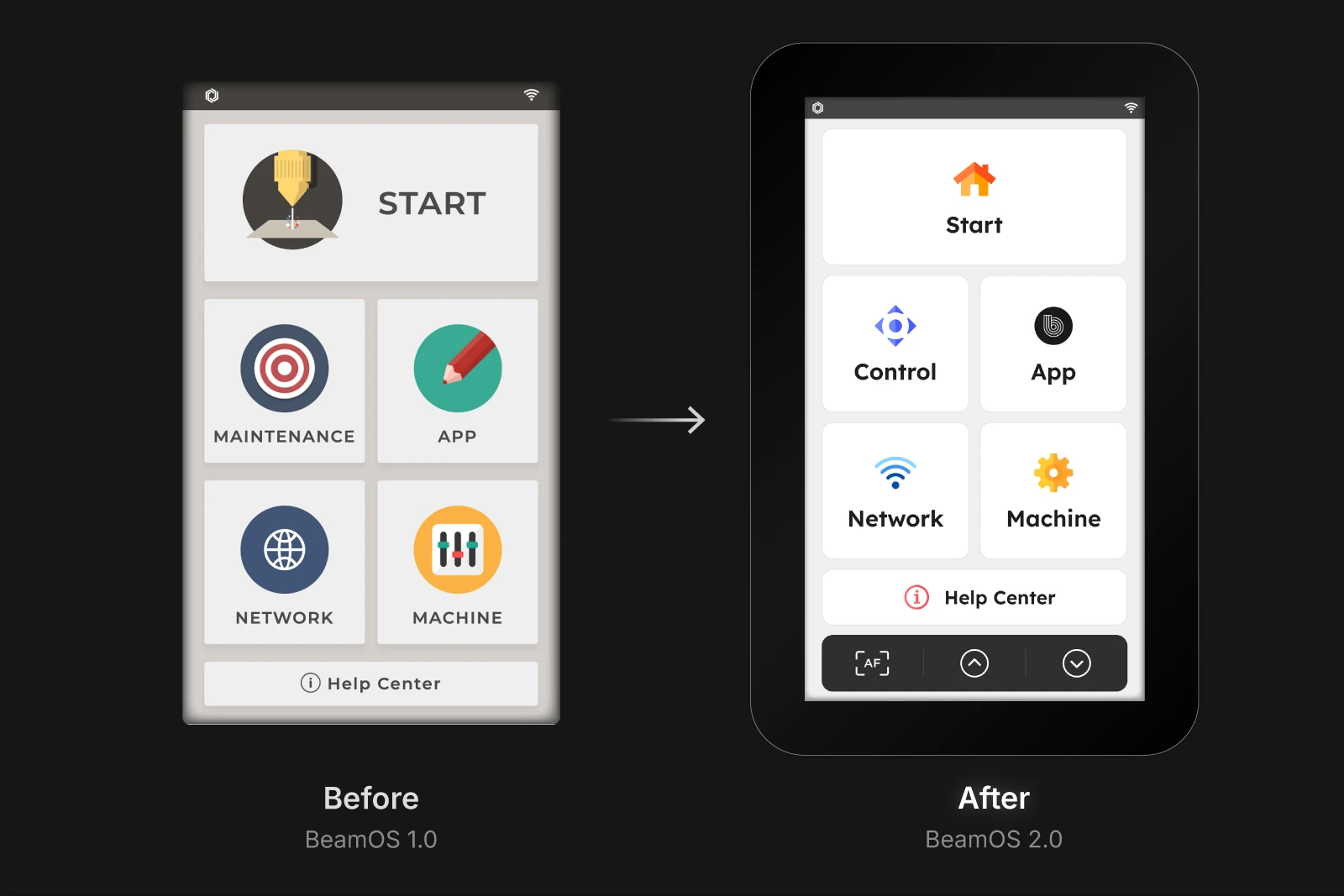
The old interface hadn't been updated in 3 years. Inconsistent buttons, unclear states, and cramped layouts frustrated users. The redesign brought visual clarity and a scalable system.

Supporting 20 languages meant designing for text expansion, Right-to-left layouts, and button truncation. Every component had to flex without breaking.
Context
The interface users touch every time they cut.
Firmware is the first thing users see when they power on their laser cutter. If it's confusing, every session starts with friction.
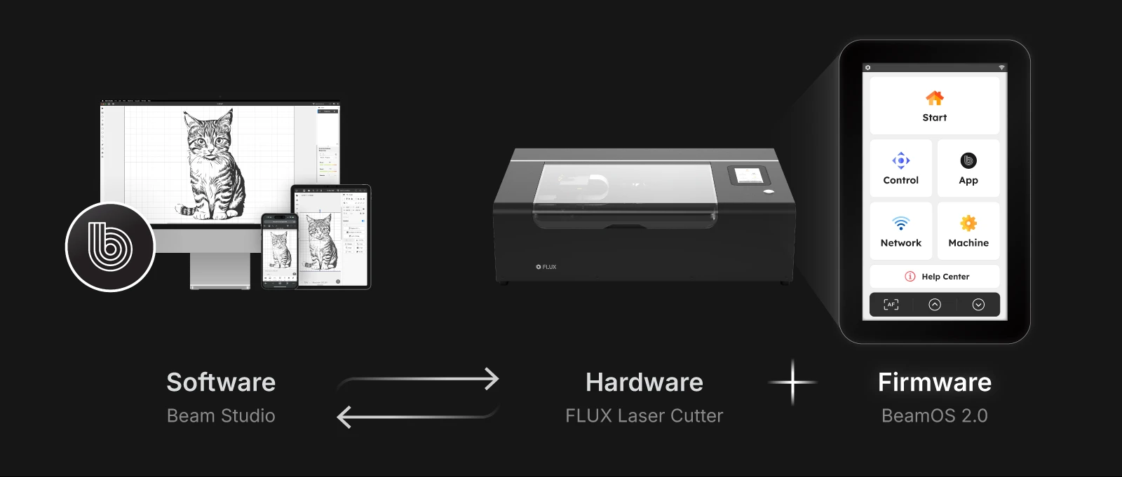
What is BeamOS?
BeamOS is the firmware that runs on FLUX laser cutters. It's the touchscreen interface users interact with to calibrate, monitor, and control their machine. Unlike Beam Studio (the desktop software), BeamOS lives on the machine itself. Users tap it with bare hands in noisy workshops.
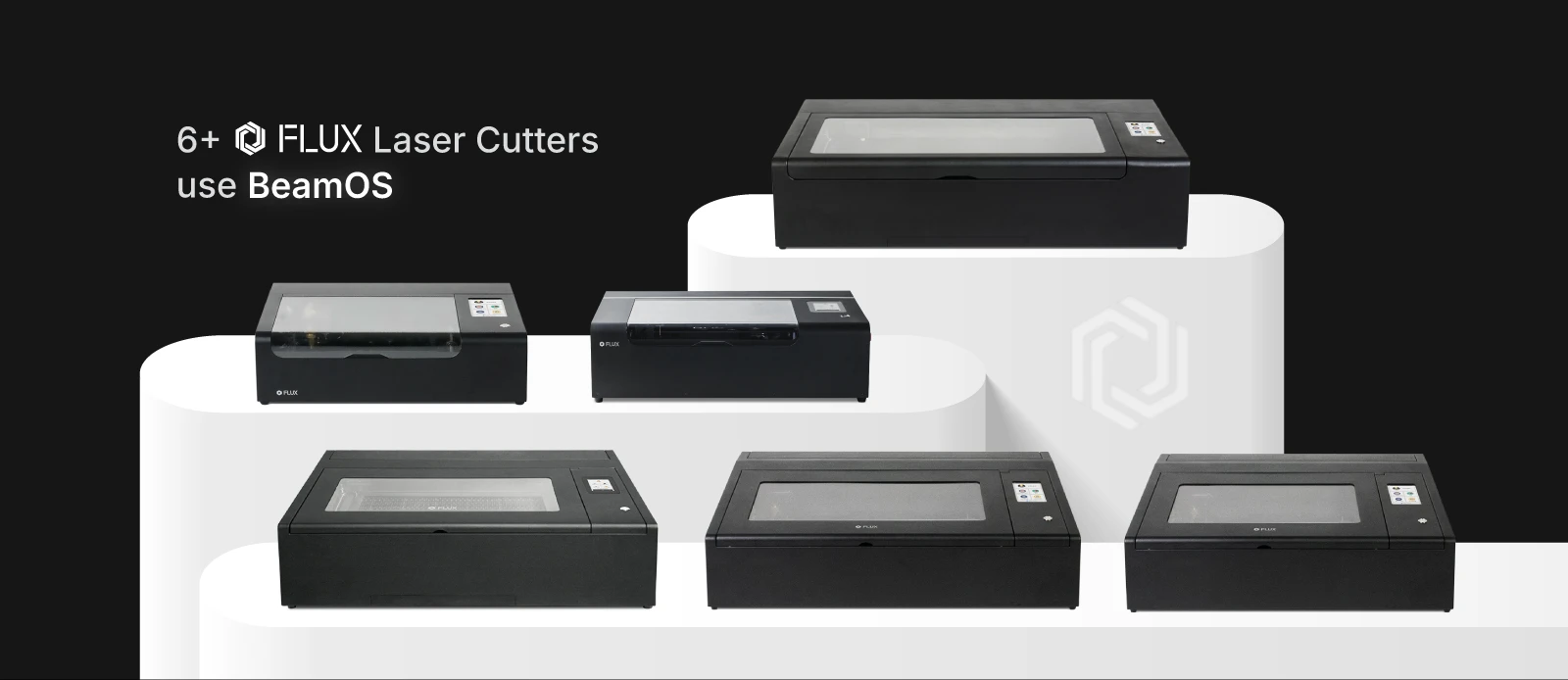
6+ machines, one interface.
FLUX sells multiple laser cutter series: beamo, Beambox, HEXA, and more. Each has different capabilities, but they all run BeamOS. Any update I designed had to work across hardware specs, unique features, and user expectations for each product line.
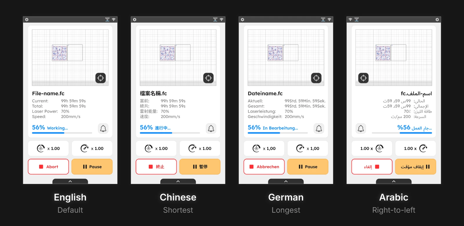
20 languages, including Right-to-left.
FLUX has distributors in 70+ countries. BeamOS supports 20 languages, including Arabic (right-to-left), German (long words), and Chinese (character density). Every button, label, and modal had to handle text expansion without truncation or overflow.
Problem
An interface that looked and felt stuck in 2021.
Dated, inconsistent visuals. Controls too small for gloved hands. Layouts that broke in other languages. The firmware worked, but every tap reminded users how old it felt.
From support tickets, our annual survey, user groups and partner feedback.
Tom is a workshop owner.
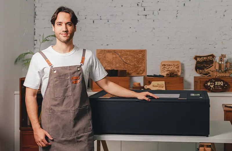
- Runs
- Two FLUX laser cutters, jobs back to back
- Works
- With gloves on, in English and German
- Needs
- Controls he can hit fast, first time
Problem 1
Inconsistent, dated visuals
Three years without an update: mismatched buttons, truncated labels, colors off brand.
"The software on my computer looks modern. The screen on my machine looks like it's from 2015."
What it led to: One visual system for every screen
Problem 2
Too small for gloved hands
Small tap targets and tight spacing meant missed taps on every busy run.
"I end up tapping twice because the buttons are too small."
What it led to: Larger touch targets and spacing
Problem 3
Translations broke layouts
German overflowed buttons, Arabic layouts broke, and every translation update risked bugs.
"I switched to German for my employee and half the buttons were cut off."
What it led to: Components that flex across 20 languages
Three problems, one design system.
The goal was to modernize the interface without disrupting workflows users already knew.
Define
Starting with what mattered most.
I had 1.5 months to redesign 6+ screens, create a design system, and support 20 languages. Before opening Figma, I needed to know where to focus.
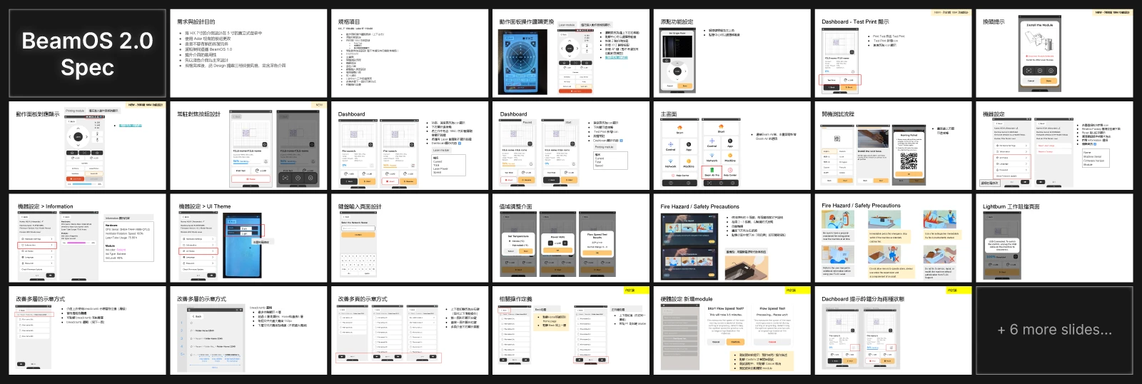
Translating specs into priorities.
The PM handed me a 33-slide spec document covering everything from dashboard layouts to breadcrumb navigation. Instead of designing everything at once, I asked: which screens do users see most? Which cause the most friction? We aligned on six priority screens: Home, Dashboard, Machine, Files, Modals, Startup.
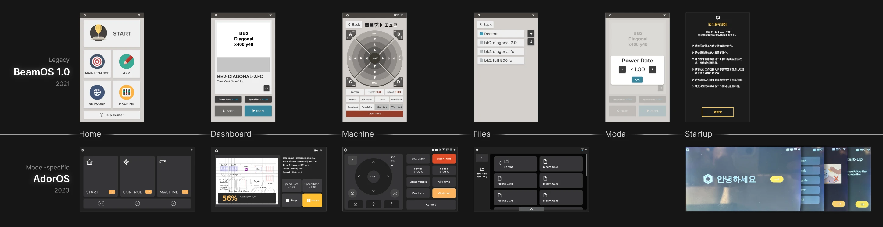
Capturing BeamOS 1.0 and AdorOS before the redesign.
I took pixel-perfect screenshots of every screen in BeamOS 1.0 and AdorOS. This gave me a reference for what users already knew, what patterns to preserve, and what needed to change. I documented inconsistencies: buttons that didn't match, colors that clashed, labels that truncated.
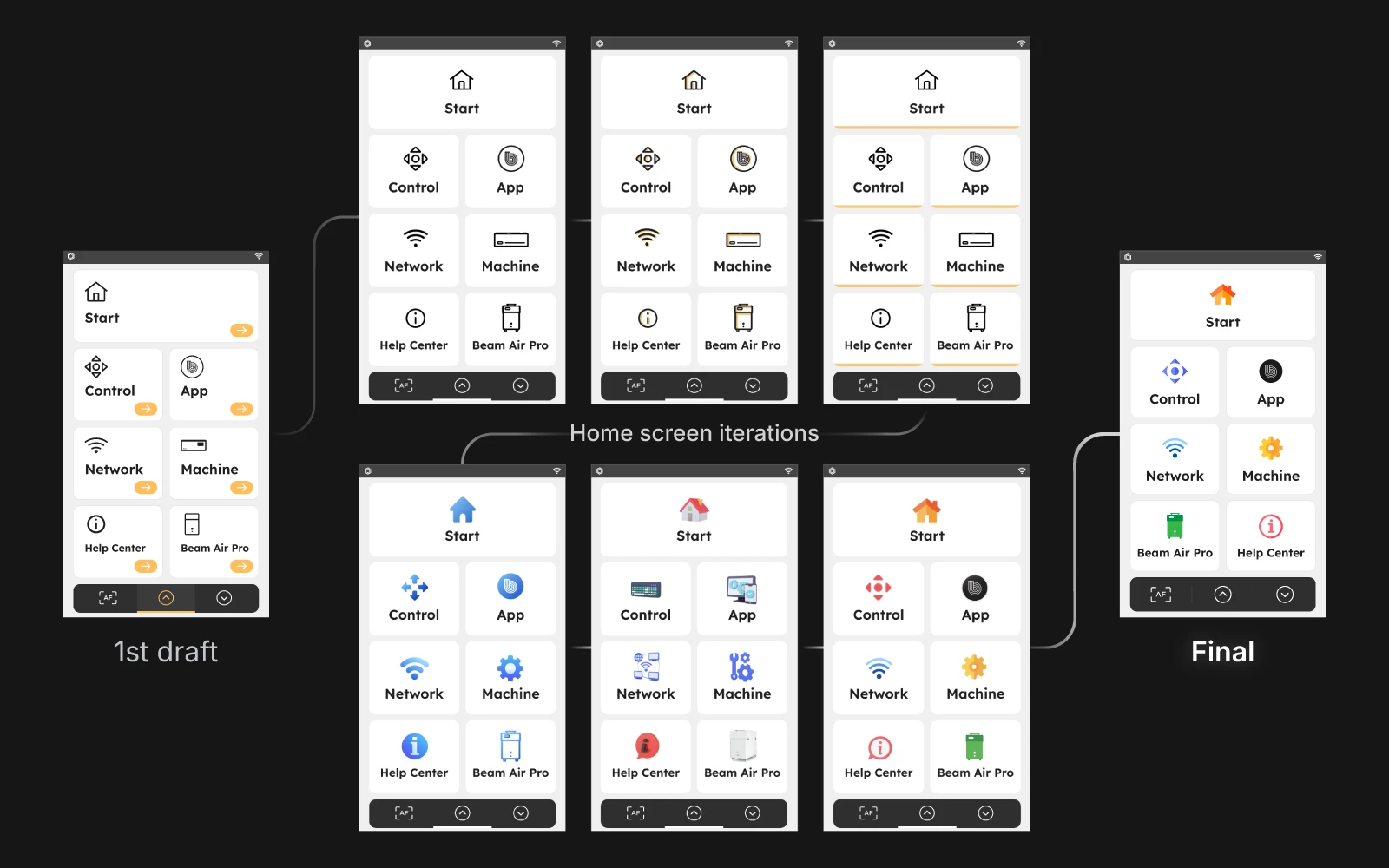
Seven directions, one winner.
I started with the Home screen since it's the first thing users see. I drafted seven high-fidelity visual directions exploring different color schemes, icon styles, and layouts. The PM and design manager reviewed all seven and selected one direction. That choice became the foundation for everything else.
Building the System
A design system that scales across 6 machines and 30 languages.
I used atomic design to build components first, then applied them to the six priority screens. Every decision had to survive German text expansion and Arabic RTL layouts.
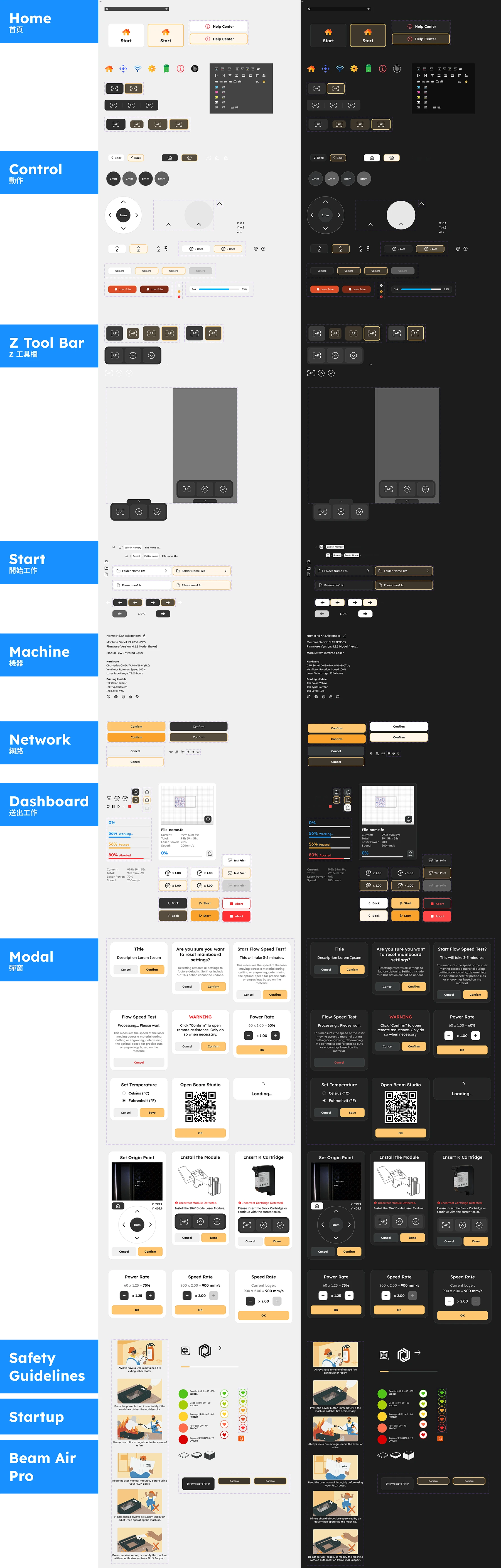
Components built to flex.
Based on the finalized menu style, I started with the foundation: colors, typography, icons, then components: buttons, inputs, status badges, and lastly: modals, nav bars, custom panels. I designed flexible widths, consistent padding, and truncation rules. Every component included states: default, hover/pressed, disabled. Dark mode wasn't just inverted colors. I adjusted contrast ratios and softened whites to reduce eye strain while keeping status colors (red, green) distinguishable.
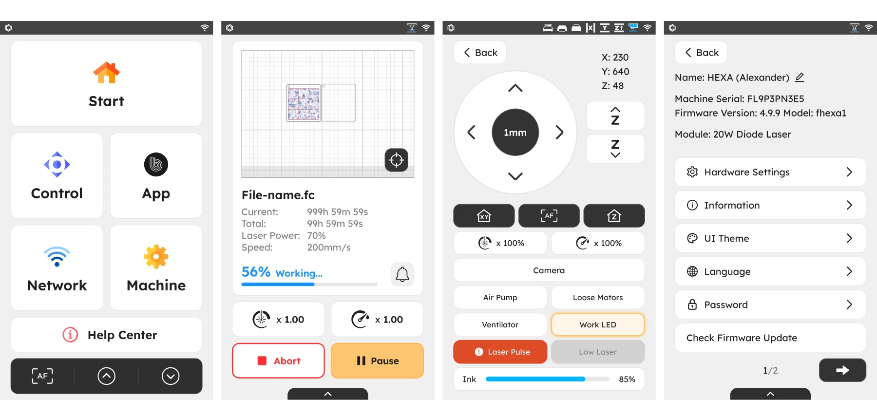
Four screens that shape every session.
Home sets the visual tone and surfaces key actions. Dashboard shows real-time job progress and alerts, letting users pause or abort mid-job. I replaced text labels with icons for power and speed to save space and reduce translation issues. Control had the most used buttons arranged from top to bottom. Settings had nested menus with arrow indicators and risky actions like "Reset to Factory" were moved to the bottom in red.
Handoff & Validation
From Figma to firmware.
I checked in with PMs and engineers weekly to ensure consistency and alignment. Before final handoff, I validated designs on actual hardware to catch issues mockups couldn't reveal.
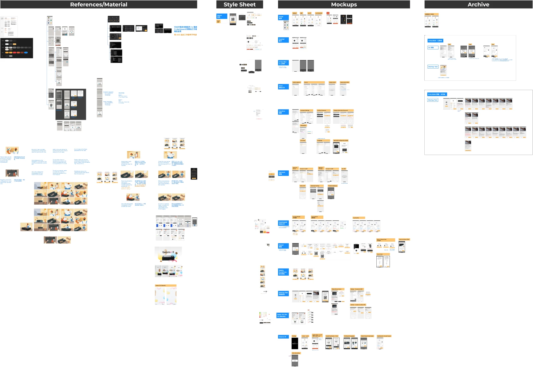
Weekly syncs kept everyone aligned.
Every week, I shared progress with PMs and walked through design decisions. We caught scope creep early, debated tradeoffs, and confirmed information architecture made sense. When specs changed mid-project, I adjusted without losing momentum. The PM signed off on each screen before I moved to the next.

Testing on real touchscreens.
Mockups lie. A button that looks fine on a monitor feels different on a 5-inch touchscreen. I tested designs on actual FLUX hardware to validate tap targets, readability, and responsiveness. I caught issues like insufficient line height at arm's length and buttons too close together for gloved fingers. Final specs were adjusted based on physical testing, not just pixel-perfect mockups.

Reflection
A modern interface ready to scale
The redesign shipped in November 2024. BeamOS now feels like it belongs to the same product family as Beam Studio and the FLUX website.
Impact
Unified experience across 6 machines
Every FLUX laser cutter now runs the same visual language. Users switching between machines don't have to relearn the interface.
Design system built for the future
New screens and features can be added without starting from scratch. Components are documented, tested, and ready for engineers to use.
20 languages without layout breakage
German, Arabic, and 18 other languages now display correctly. No more truncated buttons or broken RTL layouts.
Improved touch usability
Larger tap targets and clearer states make the interface faster to use, especially for workshop owners like Tom operating with gloves.
Next Steps

Track whether the redesign reduces confusion and errors reported by users.
Document additional components as new features are added. Keep the system evolving with the product
The spec mentioned future updates for machine health monitoring and usage tracking. Design groundwork is in place for these additions.